The Ragged Edge Is Not a Typographic Failure
Ragged-edge typography keeps word spaces natural and lines readable. Learn what causes awkward shapes and how to refine a column without forcing alignment.
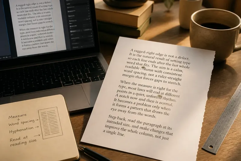
You print a page of instructions, set it beside the screen, and notice the right edge stepping in and out like a small staircase. The ragged edge is easy to blame, but forcing every line to meet a straight boundary can create a worse problem: stretched gaps between words. In ragged-edge typography, the aim is not a ruler-straight margin. It is a calm, readable column whose line endings look intentional.
Why does the right edge look uneven?
In a ragged-right setting, each line ends after the last whole word that fits. Since words vary in length, the endings naturally land at different points. That variation is not a defect; it leaves ordinary spaces between words and lets the text keep a steady measure.
The edge can still feel clumsy. A very short final word may leave a deep notch, while several nearby lines ending at similar points can form a conspicuous channel or bulge. These shapes draw attention because the eye starts tracing the margin instead of following the sentences.
Begin by checking the column, not by adding spaces. A text box that is too narrow for its type size produces frequent short lines and abrupt endings. If the page allows it, widen the measure slightly or reduce the type size with care. The goal is a comfortable line, not the fullest possible box.
Why are some word gaps suddenly huge?
That familiar river of white usually comes from fully justified text: the setting spreads spaces so each line reaches both margins. It may be useful in a column whose edges need to align, but it asks the spaces to absorb every mismatch between the words and the available width.
Try switching the paragraph to left alignment with a ragged right edge. In common tools such as Microsoft Word, Google Docs and Adobe InDesign, this is an alignment choice rather than a manual line-break exercise. Avoid inserting spaces to push individual words into place; those spaces can shift when the font, column or wording changes.
If justification is required by the design, inspect the spacing before altering the text. A wider column, a slightly smaller type size, or careful hyphenation can reduce conspicuous gaps. Hyphenation settings vary by language and application, so review the resulting breaks for familiar, sensible word divisions.
What causes an awkward notch or white channel?
A single short line is often just the result of word lengths meeting a particular measure. A run of similar short lines, however, can make the edge look lopsided. White channels that seem to connect between lines are more likely in justified text, where expanded spaces line up into visible paths.
Look at the whole paragraph at normal reading size, not only at an enlarged view of its edge. If a notch interrupts the rhythm, first consider a modest adjustment to the text box width. If that is not possible, a small edit to the sentence may change where words fall without sacrificing meaning.
Say you are laying out a short museum label in InDesign, and one line ends with a tiny “of” far inside the column. Imagine rewriting the sentence to place that word earlier, then checking the paragraph at its intended size. The expected visible result is a less abrupt indentation while the wording remains natural; if the revision sounds strained, keep the original line instead.
How can you refine a ragged edge without forcing it?
Work from larger layout choices towards smaller ones. A change to the measure affects every line; a sentence edit affects only the passage. Avoid repeated manual returns, which lock line endings in place and can leave unexpected gaps if the text later reflows.
- Check alignment. If word gaps vary sharply, choose ragged right rather than full justification where the design permits.
- Inspect the measure. If many lines end in deep notches, adjust the text box width before changing several sentences.
- Review type size and face. If the column still breaks awkwardly, try a restrained change that preserves legibility and the page’s visual hierarchy.
- Read for line-ending patterns. If similar endings make a visible channel, look for a gentle wording edit or a different line width.
- Check hyphenation. If justified lines contain wide spaces, consider appropriate hyphenation and inspect each resulting break.
- View the finished page at reading size. If the edge looks livelier at normal scale than it did under close inspection, leave it alone.
Make one adjustment at a time, then reread the passage. Changing the font, width and wording together makes it difficult to tell which choice helped. For printed work, check a proof on the intended paper: a screen view may not show how the text sits alongside headings, captions or the page margin.
When is a ragged edge the better choice?
Ragged-right alignment often suits paragraphs with varied word lengths, short editorial columns, captions and text that needs quick, comfortable scanning. It keeps spacing consistent without asking each line to fill the same width. A deliberately uneven edge can also give a page a lighter feel, provided the text block itself remains well composed.
Full justification can make sense when a publication needs a formal, aligned block, but the choice should account for column width, type size and spacing quality. Neither alignment is automatically more professional. A tidy margin is only one part of a page; the words between the margins matter just as much.
Which ragged-edge questions come up most often?
Should every line end at a different point?
No. Some variation is natural, but several lines ending in a repeated pattern can form a distracting shape. Judge the paragraph as a whole and adjust only if the pattern pulls attention away from reading.
Can I use ragged-right text in a formal document?
Often, yes, if it fits the document’s design and any supplied style requirements. Follow the relevant template or publication guidance when a format has been specified.
Do manual line breaks fix a ragged edge?
They can make one line look different in the current layout, but they may leave gaps or awkward breaks after edits. Prefer adjusting the measure or wording, and reserve manual breaks for deliberate, stable line endings such as a heading.
Is a perfectly straight right margin always easier to read?
Not necessarily. A straight margin can come with uneven word spacing, while a ragged edge preserves more consistent gaps. Choose the setting that lets the text read smoothly in its actual column.
For ragged-edge typography, the useful test is whether the edge stays in the background while the sentences lead the eye. If you have corrected strained spacing and checked the paragraph at reading size, a few uneven line endings are not a problem to solve. They are the visible trace of words fitting naturally into a line.