A Quiet Way to Reorder a One-Page Handout
Reorder a one-page handout around readers’ questions, so they can find the right action, detail or next step without decorative rules doing the work.
A colleague picks up your one-page handout at a meeting, scans the top half and asks, “What am I supposed to do?” The answer is there, but buried beneath background and a section called “Further information”. Reordering the page around the reader’s questions can make the next move easier to spot, without adding decorative rules or squeezing in more text.
The simplest method is to treat a handout as a sequence of answers. First identify what a reader needs to know, decide or do; then group related material and place each group where that question is likely to arise. The right order depends on the handout’s job. A sign-up sheet, a reference page and an explanation for a new process do not lead with the same answer.
Which question is the reader carrying?
Before changing headings, imagine the moment someone reaches for the page. Are they choosing between options, trying to complete a task, checking a detail or deciding whether the subject concerns them? That first question is a useful test for what belongs near the top.
Write down the questions in plain language, as a reader might ask them. For a community workshop, they could be: “Is this for me?”, “When is it?”, “What should I bring?” and “How do I register?” These are not necessarily the final headings. They are a way to see the page from outside the organisation that produced it.
Gather the existing text under those questions before deciding what to cut. A date, location and registration link may be scattered across a paragraph and a footer; bring them together as one answer. If a sentence serves no reader question, consider removing it or placing it in a secondary note rather than preserving it simply because it appeared in an earlier draft.
What should go first for each reader?
Sort the handout by the reader’s situation, not by a single house style. The first group below may suit a page whose audience arrives with different needs. Pick the situation that best describes the main use; if two are equally important, let the first visible section answer the more urgent question.
- Readers need to act straight away. Put the action and its essential conditions near the top. This fits booking forms, event notices and brief instructions because a reader can quickly see what to do and what they need before doing it. Background can follow once the next action is clear.
- Readers are deciding whether the subject applies to them. Start with a short explanation of who the handout is for and the circumstances it covers. This fits service information, eligibility notes and guidance for a new audience: people can recognise their situation before searching through detailed options.
- Readers need to compare choices. Present the options together, using parallel labels and the same kinds of details for each. This fits a page describing routes, appointment types or materials to select. A shared pattern makes differences visible without asking readers to remember details from an earlier section.
- Readers expect to consult the page while doing a task. Order the sections in the sequence the task unfolds, with each instruction beside the relevant detail. This fits a packing list, a classroom activity or a service request form. A reader can move down the page as the task advances, rather than hunting between an introduction and a separate list of actions.
- Readers mainly need to look up one fact. Put the most likely lookup items in a distinct, easy-to-scan group, with labels such as “Where”, “Contact” or “Documents”. This fits a reference handout that may be opened at different points. Keep explanation nearby when a bare fact could be misunderstood.
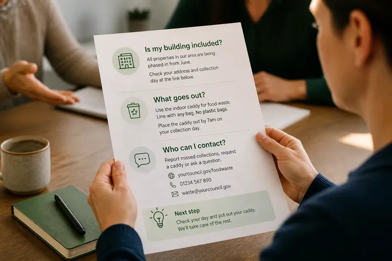
Say you are preparing a handout for a residents’ meeting about a new food-waste collection. Imagine the main reader wants to know whether their building is included, then what to put out and where to ask about missed collections. You could place coverage first, collection instructions second and contact details last. The expected visible result is a page whose first section answers the eligibility question before the reader reaches the practical directions; the arrangement does not depend on a line or box to signal priority.
How can groups make the order visible?
Once the sequence is set, give each group a descriptive heading and keep its answer beneath it. “Before you arrive” says more than “Information”; “Choose a collection option” tells readers what kind of material follows. Headings should describe the content, not promise an outcome the section cannot deliver.
Use spacing and alignment to show which details belong together. A heading followed closely by its paragraph reads as a unit; a larger gap before the next heading signals a new group. Keep labels in a consistent position, and use the same visual treatment for sections with the same role. These quiet cues are usually enough to separate groups without adding decorative rules.
Lists help when readers need to scan distinct items, compare options or follow an order. A short paragraph is better when the ideas depend on one another and would become choppy as separate bullets. Avoid turning every sentence into a list item: too many isolated fragments can make a handout feel like a collection of notices rather than one useful page.
For a one-page layout, restraint also means allowing the page to breathe. If the revised order creates crowding, shorten repeated explanations and remove details that do not answer a reader’s likely question. Do not shrink type merely to preserve a paragraph that belongs elsewhere. If a crucial explanation cannot fit legibly, the handout may need a companion page or a link to fuller guidance.
What should you check before printing?
Read the page in the order a new reader is likely to encounter it. Check whether the first heading points to the right question, whether related details sit together and whether the final section gives a useful next step or reference point. Then look away and return to the page: can you find the date, action or contact detail without rereading every paragraph?
Ask someone unfamiliar with the subject to locate one specific answer, such as where to register or which option applies. Watch where they look first and where they pause. If they search in the wrong group, revise the heading or move the answer; adding ornament may make the group more prominent without making its purpose clearer.
For printed copies, check that links, phone details and addresses are legible and complete, and that the page still works in black and white if it may be photocopied. For a digital PDF, confirm that the reading order remains sensible when viewed on a small screen. The file’s visual arrangement and its selectable text should both support the same sequence.
Which question should you settle before printing?
Should background information come first?
Use background first when readers need it to understand whether the rest applies to them. If they can act or choose without it, place the relevant action or option before the longer explanation.
Should every section have the same amount of space?
No. Give groups enough separation to show their boundaries, while keeping a heading close to the content it names. Equal gaps can be tidy, but they should not split a label from its answer or make a brief note look as important as a main section.
What if one fact belongs in two places?
Keep the full explanation in the group where readers most need it, then use a short pointer elsewhere if necessary. Repeating a key date or contact can help, but duplicating long instructions invites mismatched versions during later edits.
When should a handout become more than one page?
Consider another page when important answers become cramped, headings lose their meaning or readers must choose between legibility and completeness. A one-page format is useful only while it can hold the information readers need in a clear order.
To reorder a one-page handout, keep the reader’s first question in view as you arrange the rest: action, decision, comparison, task sequence or lookup. Clear groups and descriptive headings make that order visible. The final check is simple: can someone who did not help write the page find the answer they came for and recognise what to do next?