Leading or Paragraph Space: Two Different Pauses
Leading or paragraph space? Learn how to use line spacing for reading flow and paragraph gaps for clear shifts in thought, without muddying the page.
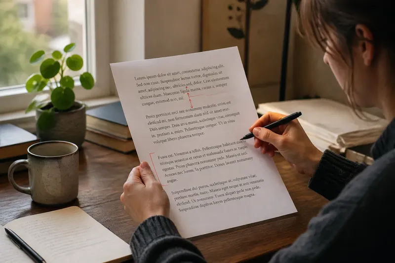
A page of text can feel cramped even when its margins are generous. Often the culprit is a mismatch between two quiet signals: the distance from one line to the next and the gap before a new paragraph. Leading or paragraph space is not a choice between two versions of the same setting. Each makes a different kind of pause, and knowing which one to adjust helps text feel both readable and coherent.
Leading shapes the flow within a paragraph; paragraph space marks a change between paragraphs. These six distinctions make it easier to decide which pause a page needs.
1. What does leading ask the reader to do?
Leading is the vertical distance between successive lines of type. In a word processor, the relevant control may be called line spacing; in a layout programme such as Adobe InDesign, it is often labelled leading. Whatever the name, it determines how closely the lines of a paragraph sit together.
Because the setting applies line after line, leading shapes the paragraph’s overall texture. Tight leading makes lines feel more connected and the block more compact. More generous leading gives each line a little room, making it easier for the eye to return to the left edge and pick up the next one.
That pause is small and recurring. It does not normally announce a change in the writer’s thought. Instead, it supports the steady movement of reading through a sentence, then on to the next line. If a paragraph is hard to follow even though its ideas are related, leading may be the setting to inspect.
2. What does paragraph space signal?
Paragraph space is the extra vertical gap between one paragraph and the next. Unlike leading, it marks a boundary in the text. The reader sees a new block and is invited to register a fresh point, a turn in the argument, or a change of scene.
That boundary can be made with space after a paragraph, a first-line indent, or—in some designs—a combination of structural cues. Adding a gap is particularly clear in forms where paragraphs are not indented, such as many web articles and contemporary reports. In long, continuous text, a modest indent may separate paragraphs without interrupting the page with repeated blank-looking bands.
Paragraph space is not just a decorative breather. Used consistently, it tells the reader that the next block has a distinct role. If every sentence is separated by a large gap, the page can make connected thoughts look like a string of unrelated notes.
3. How do the two pauses differ in practice?
Think of leading as the spacing inside a spoken phrase and paragraph space as the pause before a new one. The analogy is not exact, but it captures the difference in scale and purpose: leading supports continuity; paragraph space signals a boundary.
Imagine you are laying out a short museum leaflet. Its explanatory paragraphs feel dense, but each contains a complete thought. If you loosen the leading slightly, the lines become easier to follow without suggesting that the text has broken into more sections. If instead you add a conspicuous gap after every paragraph, readers are more likely to perceive each one as a separate stop.
The expected visual result depends on the typeface, the column width and the surrounding page design. The useful question is not simply whether the page needs “more air”; it is whether readers need more room to track lines, or a clearer signal at a change of thought.
4. Which setting should you adjust first?
Look at the page at its intended reading size, rather than judging a tiny zoomed-out preview. Follow several lines with your eyes. If it is difficult to find the start of the next line, or the paragraph looks like a dark slab, consider the leading. If the line-to-line flow is comfortable but one paragraph runs straight into the next, consider paragraph space or another paragraph marker.
Make one change at a time. In a document editor, check whether paragraph spacing is controlled in the paragraph settings rather than by pressing Return twice; repeated blank lines can behave unpredictably when text reflows. In InDesign, inspect the paragraph style’s leading and space-after controls. Keeping those settings in styles also makes consistent adjustments easier than correcting every paragraph by hand.
After changing a setting, read the same passage again. Look for a clear distinction between the internal rhythm of each paragraph and the transition between blocks. If both pauses now feel equally strong, the page may be over-signalling. The aim is not maximum openness, but a hierarchy the reader can recognise without stopping to decode it.
5. What changes when type or layout changes?
Leading does not have one ideal setting for every typeface. A face with a generous apparent height, long ascenders or descenders, or a lively texture may need different treatment from a compact, even-looking face. The size of the text matters too: a setting that feels spacious in a heading may feel slow and disconnected in body copy.
Paragraph space is affected by the same page context, but its main job remains separation. In a narrow text column, a large gap can consume attention and make short paragraphs seem isolated. In a broad, dense report, a clear paragraph break may be especially useful because the reader sees a larger sweep of text at once. These are visual judgements, not fixed rules.
Also check what the surrounding design already communicates. A heading, a change of alignment, a rule or a shift in background may already mark a new section. If paragraph space is also enlarged at every transition, several signals can compete. Use the space to clarify the structure that is present, rather than adding emphasis everywhere.
6. How do leading and paragraph space work together?
They work best when their different jobs remain visible. Leading should create a comfortable path through each block; paragraph space should be strong enough to show where one block ends and another begins. If the paragraph gap is barely distinguishable from the line spacing, the boundary may disappear. If it is dramatically larger, it may interrupt the argument.
For a page without paragraph indents, a gap after each paragraph often provides a simple, consistent cue. For a continuous article or book-like page, indents can preserve a more even vertical texture, with extra space reserved for larger breaks. Either approach can work; mixing them without a reason can make the text feel uncertain about its own structure.
Leading or paragraph space is therefore a question of what kind of pause the reader needs. Adjust the line-to-line interval when the text is difficult to track; adjust the paragraph boundary when a shift in thought is hard to see. Before adding either, inspect the typeface, paragraph style and other signals already on the page. A small, deliberate distinction can do more than a blanket increase in whitespace.
Which spacing question are you trying to solve?
Does leading mean the gap between paragraphs?
No. Leading is the distance between lines within text, while paragraph spacing separates one paragraph from the next. They affect different points in the reading flow.
Should paragraph spacing be larger than leading?
It should read as a distinct boundary if it is being used to separate paragraphs, but there is no universal setting. Judge the difference in the finished layout, alongside the typeface and any indents or headings.
Can I use blank lines instead of paragraph spacing?
You can, but repeated empty paragraphs may shift awkwardly when text is edited or reflowed. A paragraph-style setting is usually easier to apply consistently and revise later.
Should I add both paragraph spacing and a first-line indent?
Sometimes, but each cue should have a clear purpose. If both appear after every paragraph, the separation may become too emphatic; choose a consistent treatment that suits the format and the way the text is organised.
When the page still feels wrong, hide the words for a moment and look at the shapes of the text blocks. If the lines need breathing room, change leading; if the blocks need clearer boundaries, change paragraph spacing. Then read the page once more: the right pause should help the next thought arrive without calling attention to itself.